
Companies grow up just like people do. And it’s only natural that our looks change in the process, too. That’s what happened to us, to Slido. The time has come to give the Slido brand a new look.
Over the years, we developed our brand path along with some distinctive brand elements such as our dot and Slido green. At the same time, our visual communication started to look more and more scattered.
We wanted to bring it all together in a coherent system and create an overarching company brand.
A brand with a strong visual identity that will set us apart from our competitors, create positive emotions with our customers and make our team proud of working at Slido.
After months of soul-searching discussions, trial and error, but also epiphanies, we are ready to bring the new Slido brand to the world. Here is our story.
Why we decided to refresh the brand
Refreshing a brand is a lengthy process with many curves and dead ends. Yet companies embark on it understanding its added value. For us, it was mainly these two reasons:
Inconsistent communication
Every time we had to create a banner for a tradeshow or a social media post, we started the design process from scratch. It was unsustainable. At a certain point, we looked at our design assets and realized what we had all suspected – we were inconsistent.
We knew it had to change. If we wanted to be recognizable, we had to start communicating consistently across all marketing channels and touchpoints.
Time to dress up
Over the years, we have started collaborating with some incredible clients. And we felt like we were still wearing a hoodie at a conference table. It was time to dress up while staying who we are. Look smart but casual.
With these two reasons, we rolled up our sleeves and got down to business.
The winding path to the brand refresh
So how did we go about it? Here’s a behind-the-scenes look at how we got where we are, and everything that has changed.
Step 1: Codifying our mission and vision
Like clothes, a brand represents who you are on the inside.
We knew that intuitively.
But to put it down in writing was a whole other story. We locked ourselves in the room (literally) for two full-day sessions to research, analyze and put down the brand concept.
We came out, waving a draft in our hand.
But with 150+ people, it’s not only about a discussion in a closed group. We wanted to hear the voices of all the team members.
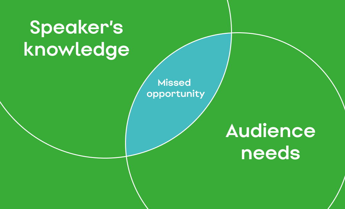
In a short survey, we asked: “Why do we exist?” Among many complementing things, this is what our colleagues submitted:
To create a better dialogue where it was not possible or easy before.
Transform how meetings and events are run.
Empower the shy and reserved.
Yes! It was all aligning nicely with the mission we had codified in the room – giving a voice to the audience.
The second survey question touched on, “If Slido were a person, how would you describe them?”
As a result of this exercise, we condensed 4 characteristics that describe who we are.
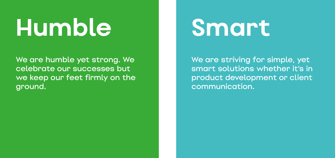
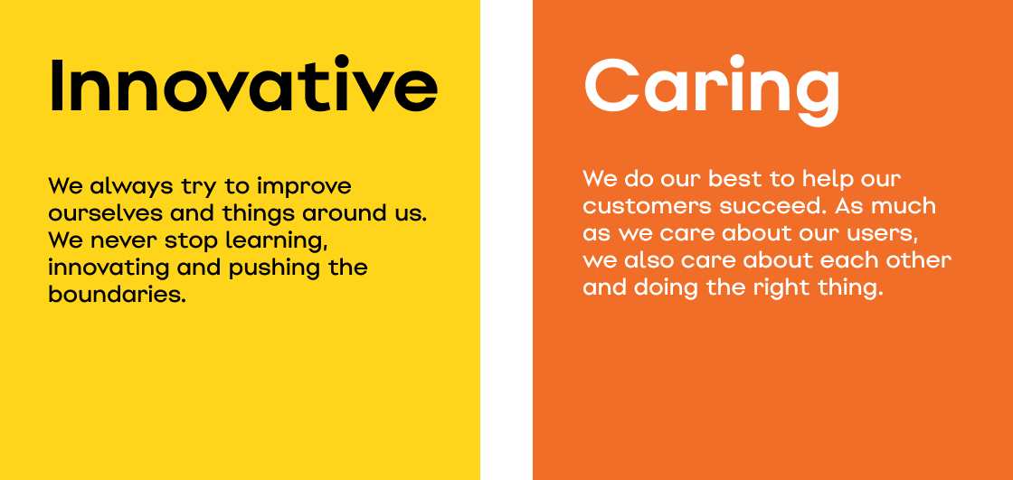
Those were the traits we hoped to capture in our new brand. Plus, they reflected our three main values: Simply clever. We care. Don’t stop. We felt like we were on a good track there.
Step 2: Bringing in some external help
For all of us, it was the first time we had ever worked on a brand refresh. So it was only natural to call in the experts for help.
We partnered with Slovak studio Go Bigname which helped us to give Slido a new look. They created our very own font, defined the color palette, and designed the new logo.
In the process, they inspired us with tons of creative ideas, which we later built on internally. Big thanks to Michal Pastier and the team!
Step 3: Developing the visual identity
Once we had laid the foundations, it was time to put matters into the hands of our designers.
But before we get into details, let us tackle the most burning question first.
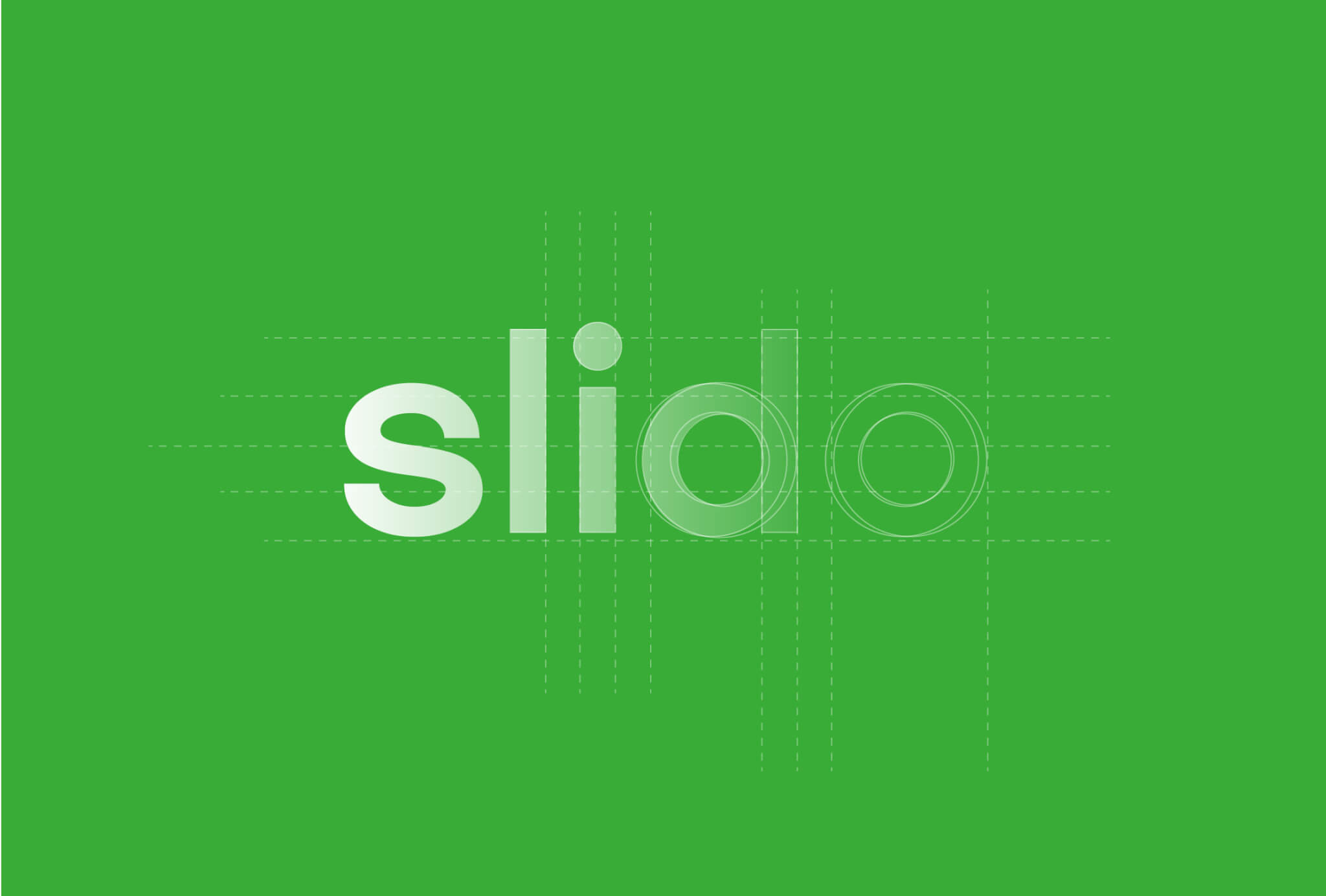
What happened to the dot?
The dot has been with us since the very beginning. As much as we were attached to it, the dot in the middle of the name was causing a lot of confusion.
It was not uncommon for event participants to type sli.do.com into the browser, which got them nowhere. Plus, the inconsistency of the name. Is it Sli.do, sli.do, Slido or slido?
We fought and defended the dot in endless discussions. Yet it became clearer every time we looked at it, that the dot would have to go if we wanted to ensure the coherence.
We put a dot behind our dot era. It’s Slido from now on.
Note: Don’t worry, all the domains with sli.do will work as they did till now.
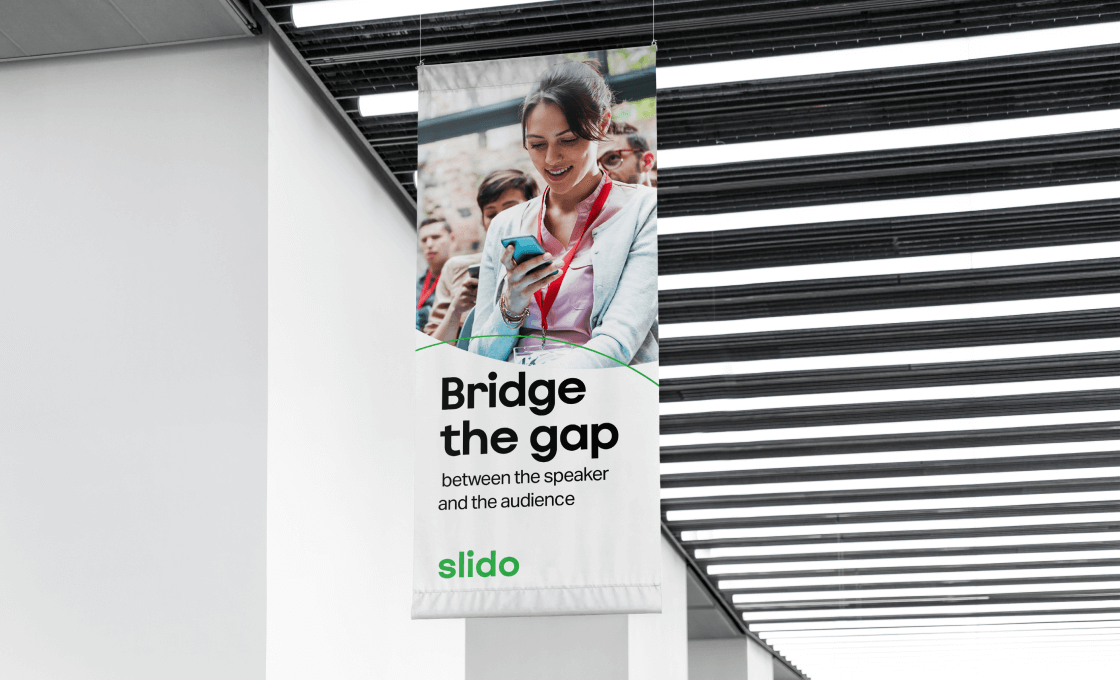
Bridge the gap concept
Ok, we dropped the dot. What now?
We still wanted to stay loyal to the shape and use a similar geometric object in our concept. And since the closest one was the circle, we started to play around with it.
It was tough. There were myriads of ideas, but in the end, we drew a full circle (pun intended).
After lots of experimentation, we returned to the idea of two crossing circles.
It must have been a subconscious thing.
Because even in the first pitch decks, we used to show two crossing circles to visualize our mission.
After all, that’s what we ultimately do: ‘bridge the gap’ between the speakers and the audience.
Things clicked. We knew that this was something we wanted to capture in our visual communication.
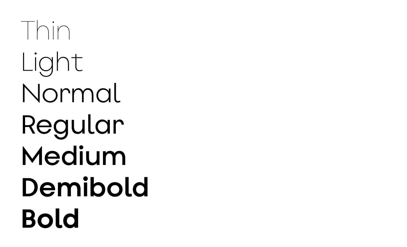
Say hello to Slido Sans
We looked into the font too.
As a part of the rebranding, the folks at Go Bigname created a beautiful, custom-made font for Slido. It struck us as simple, yet bold and distinctive. It was love at first sight.
And we decided to make it a building element of our visual language. You will see it a lot in our brand assets.
New logo
Once we decided to drop the dot, the logo naturally needed an update too.
The first time Big Name presented a concept of our new logo, it instantly resonated with us.
It is based on our custom typography and its main color is green on a white background (with exceptions for special usage).
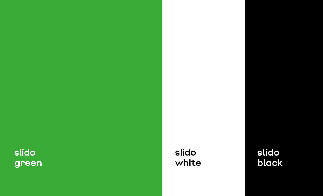
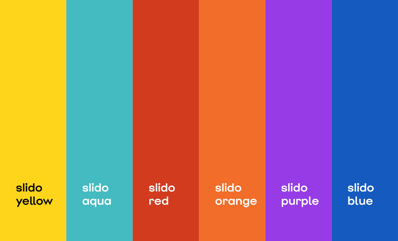
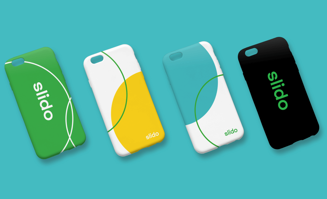
Color palette
We remained loyal to Slido green as our most distinctive brand asset. We changed the hue for better accessibility on screens.
In addition, we also defined the complementary colors and the usage ratio. Our main identity is still based on green, with lots of white space and black elements.
On top of the main palette, we added in secondary colors to bring more life to some of our brand assets, blog visuals and more creative visual explorations.
Photography
Along with the new font, photography will play a major role in our visual identity. We believe it can best express the emotions connected with using our product, while also illustrating scenarios and use cases where Slido helps with interaction.

Step 4: Creating the system
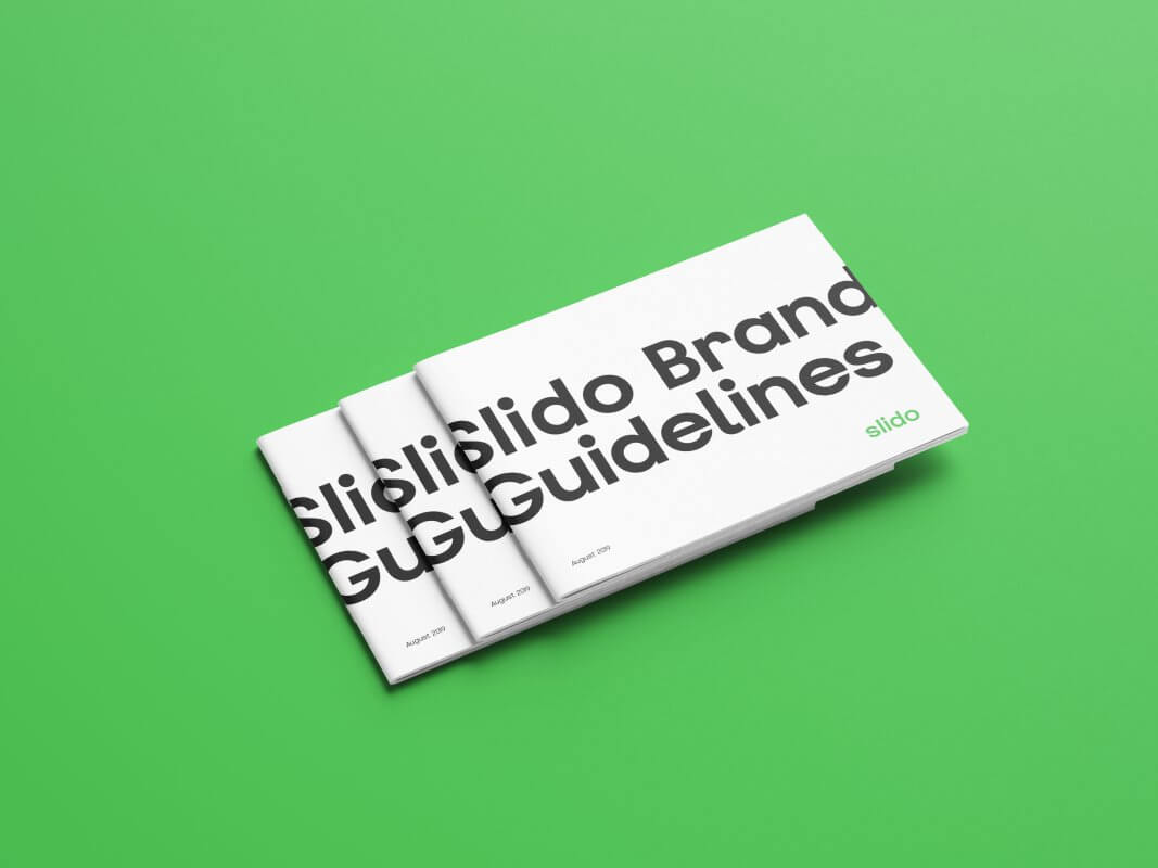
The last part of the process was to put all the pieces together in a new design manual. This is the first official codification of our brand guidelines, and makes us super excited! We’ll let you peek inside (and grab a copy) in a separate blog post, coming soon.
The result
Ok. We described the individual ingredients and the process. Now let’s take a look at the cooked meal.
New website
As with other brands, our website is the most prominent window shop of our product in the online environment. So it was our top priority to materialize our new brand there. And we did. Go check it out, if you haven’t done so yet.

New merch and materials
We are also putting a fresh coat of paint on our other brand assets: merchandise, online documents, banners, presentations and heaps more. So you have a consistent brand experience wherever you interact with us.
Here are a few samples.

What’s next
We can put a checkmark on the brand launch. But branding is a never-ending process. We’ll be rolling out our new identity over the next few months, updating everything online and in our offices.
By doing so, we hope to bring more clarity and consistency to our messaging, and ultimately give Slido a fresh, bold look. We can’t wait to see how our new brand will resonate with you.
Please, let us know what you think.
Your Slido Team


